LRW Insights is a dashboard that helps translate sophisticated data analytics into actionable business strategies for its clients, by compiling market research from various 3rd party and locally generated sources.
LRW was a client of LA-based product developer Carbon 5, which needed a hands-on Art Director for the project to work closely with the engineering and executive teams.
We had a timeline of six weeks for design, and three additional weeks for development. I completed conceptualizing and creating the user flow, user interface, and product design within the first four weeks, and created the design system elements and brand identity prior to the hand-off during the last two weeks.
Below are the project components we created, as well as the conceptual explorations and art-directional inspirations.

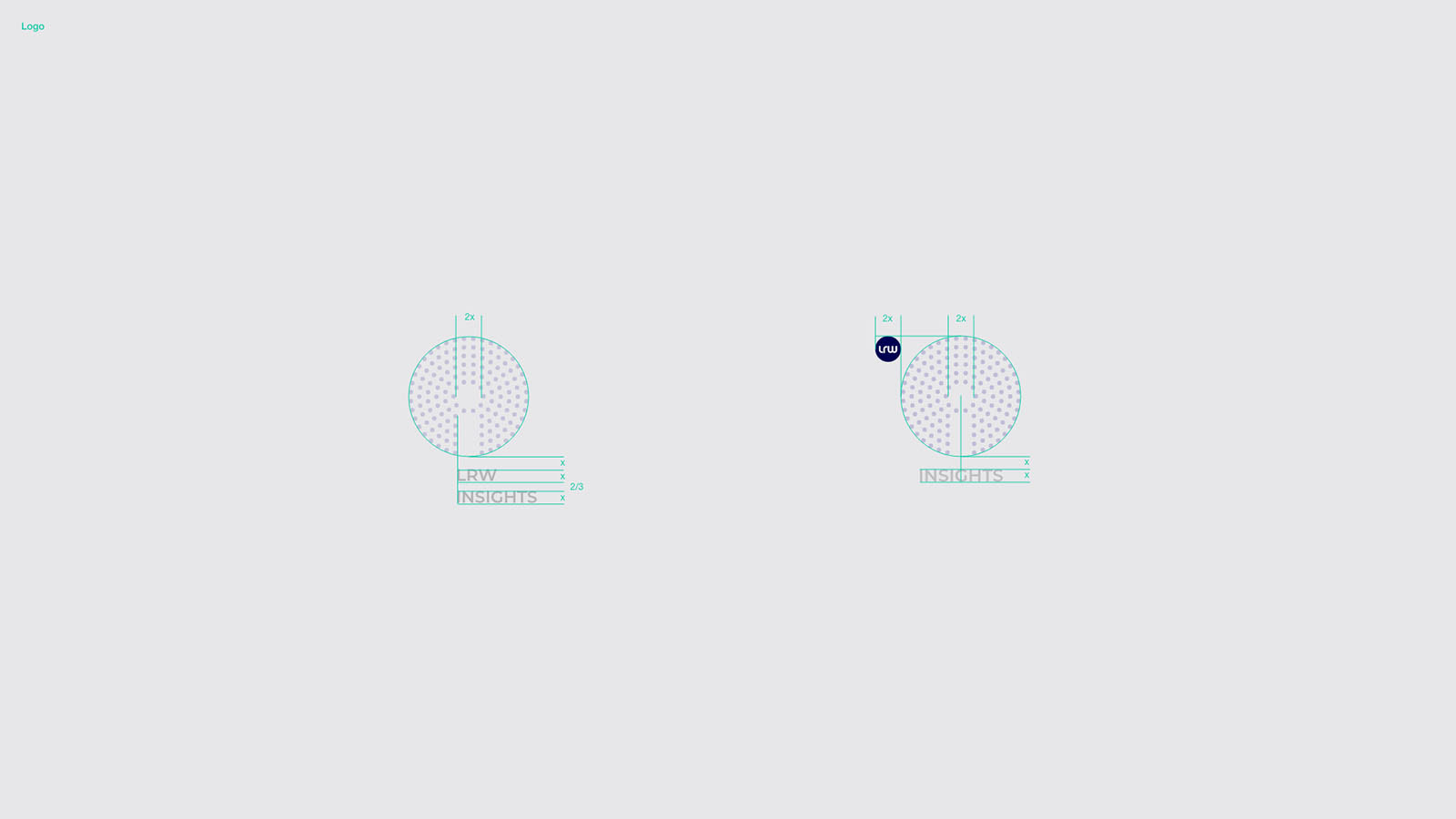
Product identity and logo animation

Conceptual research based my work:
Whiteboarding exercise I led during the week of kick-off.
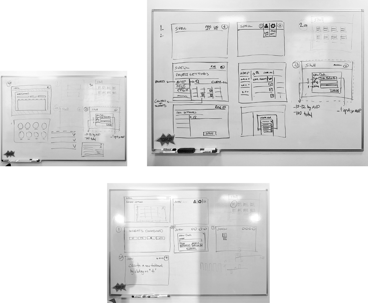
Early conceptual explorations:

User Flow & Pages Designed
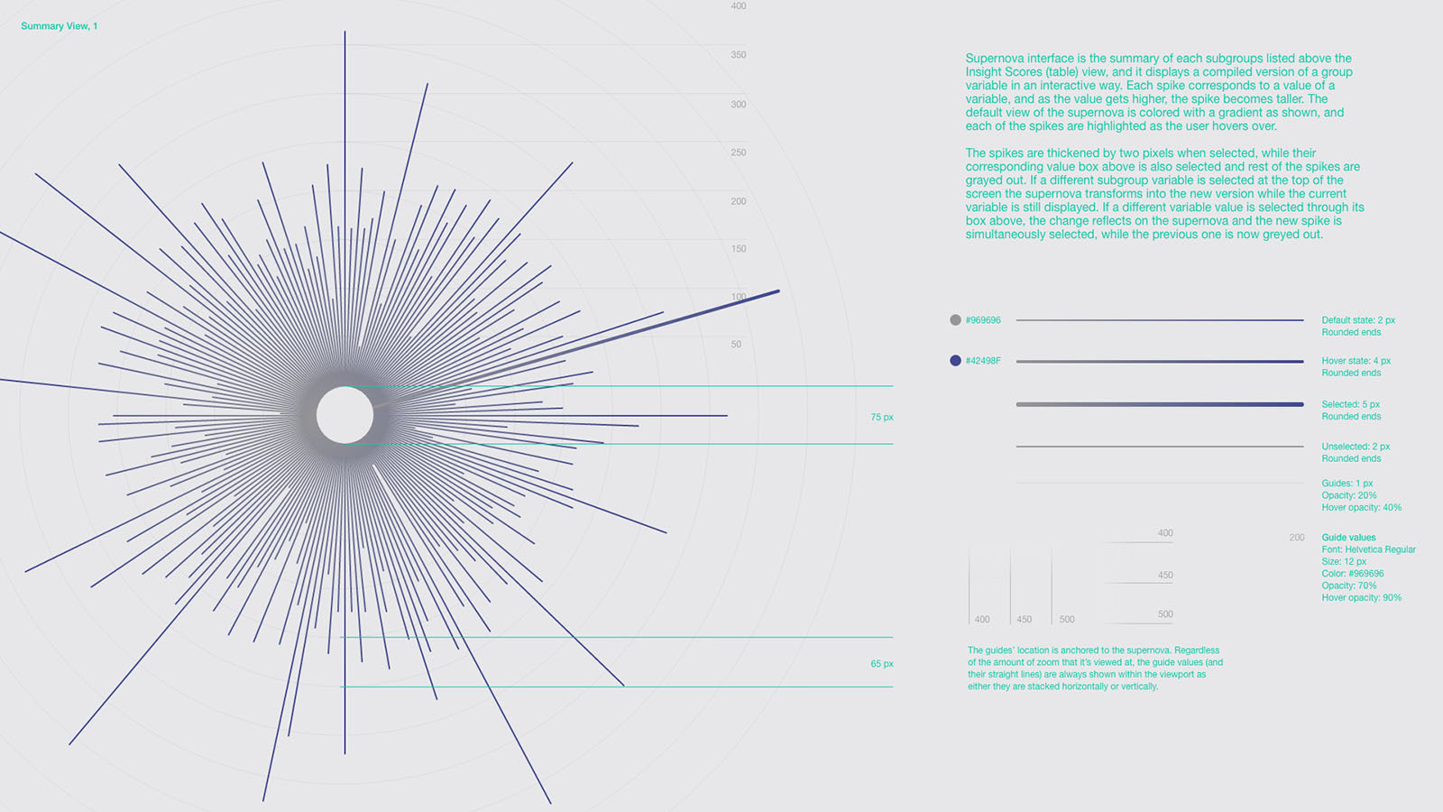
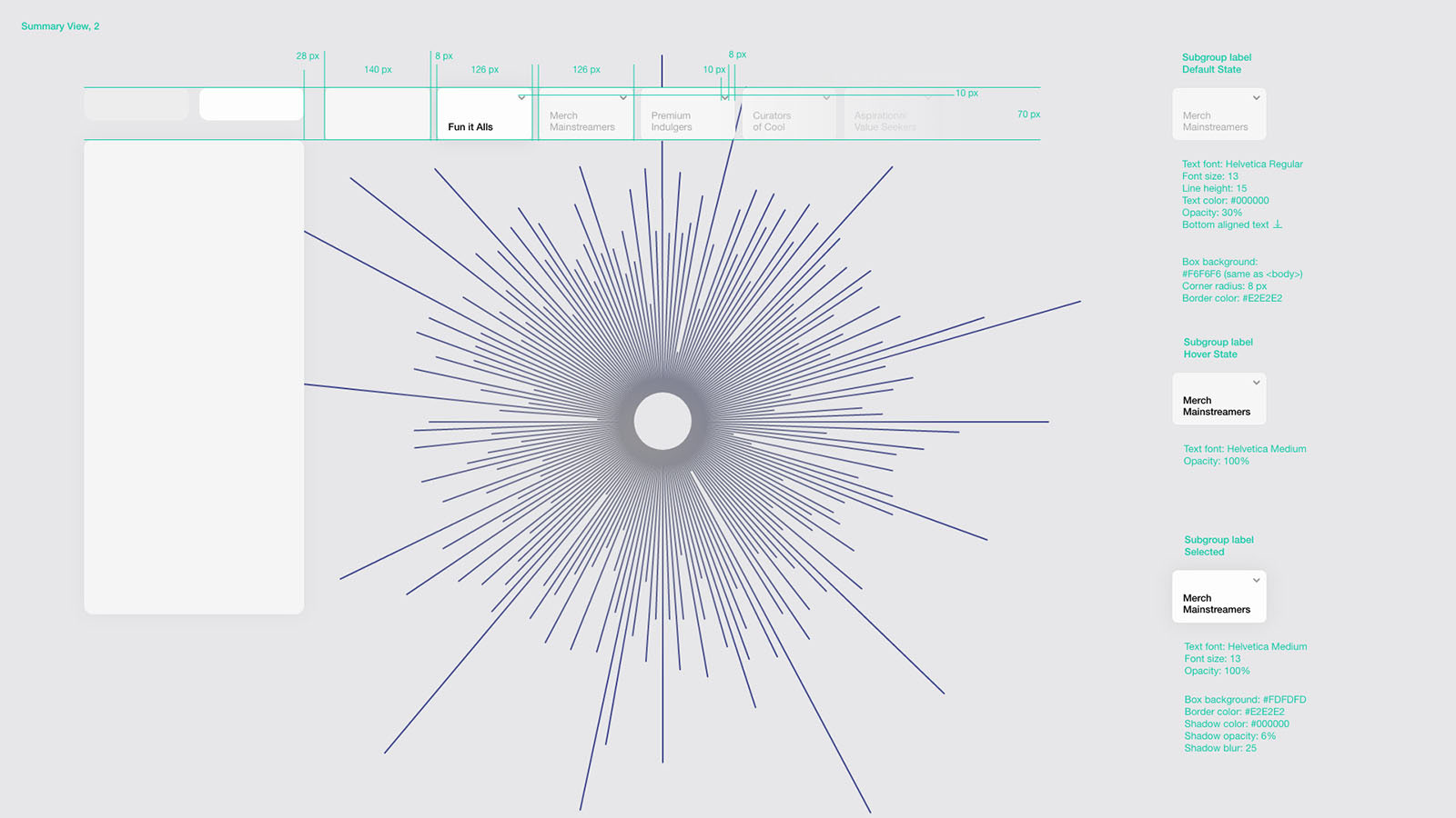
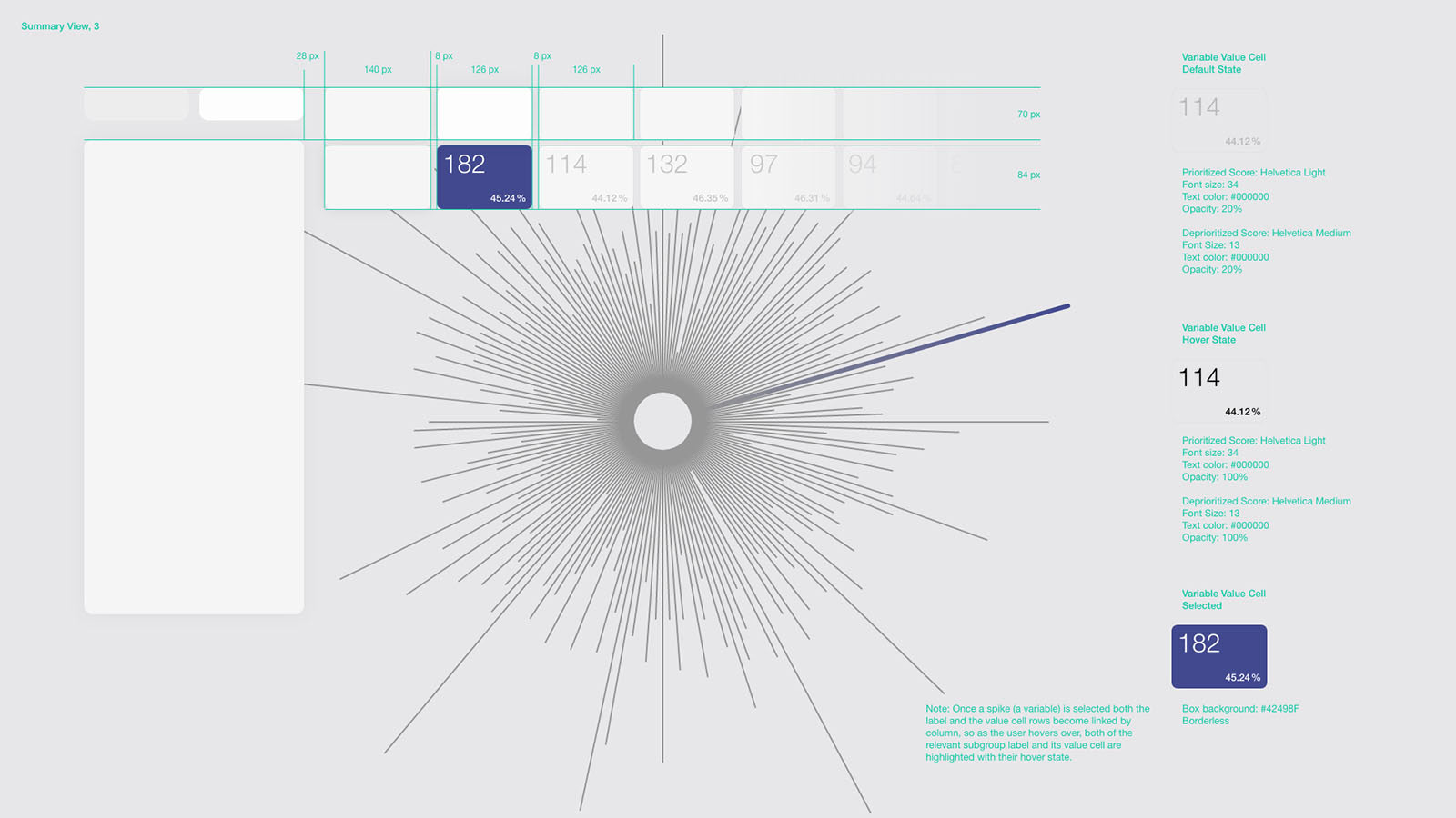
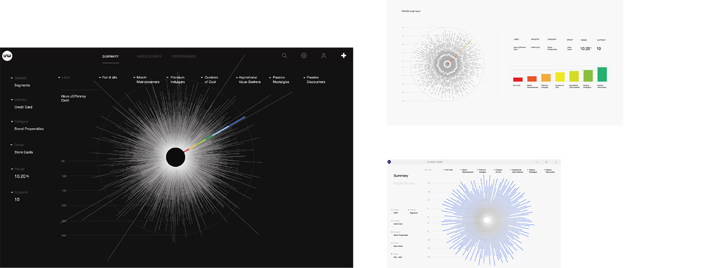
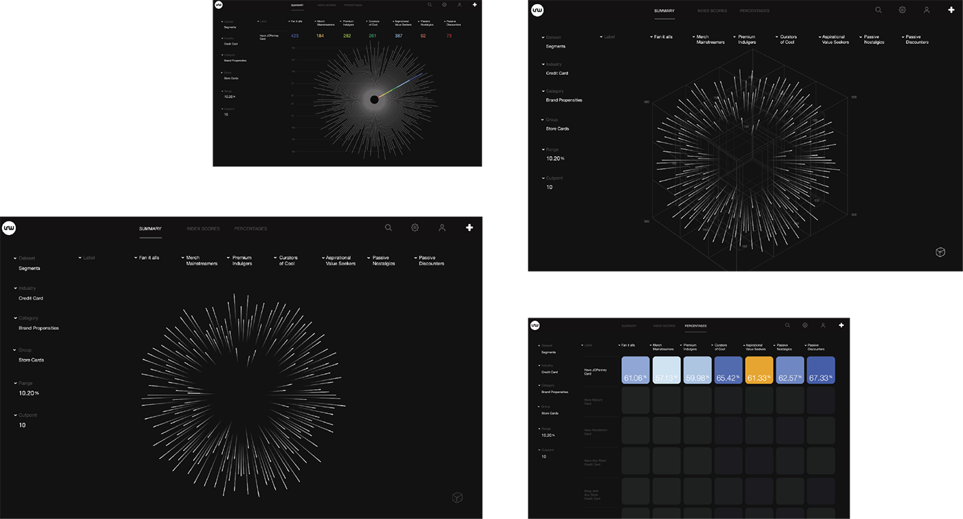
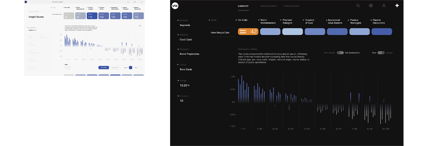
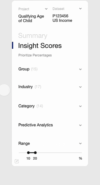
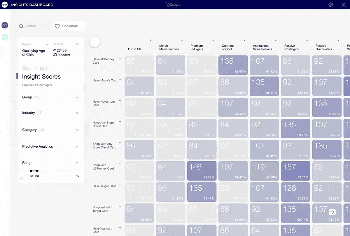
The UI is split into two main phases: The summary view is where each one of the group variables (which corresponds to a group segment in research) is viewed based on the highest and lowest value, visually, and Insight Scores, in which users can see the scores and cross-correlate individual data sets with group variables (main segments)
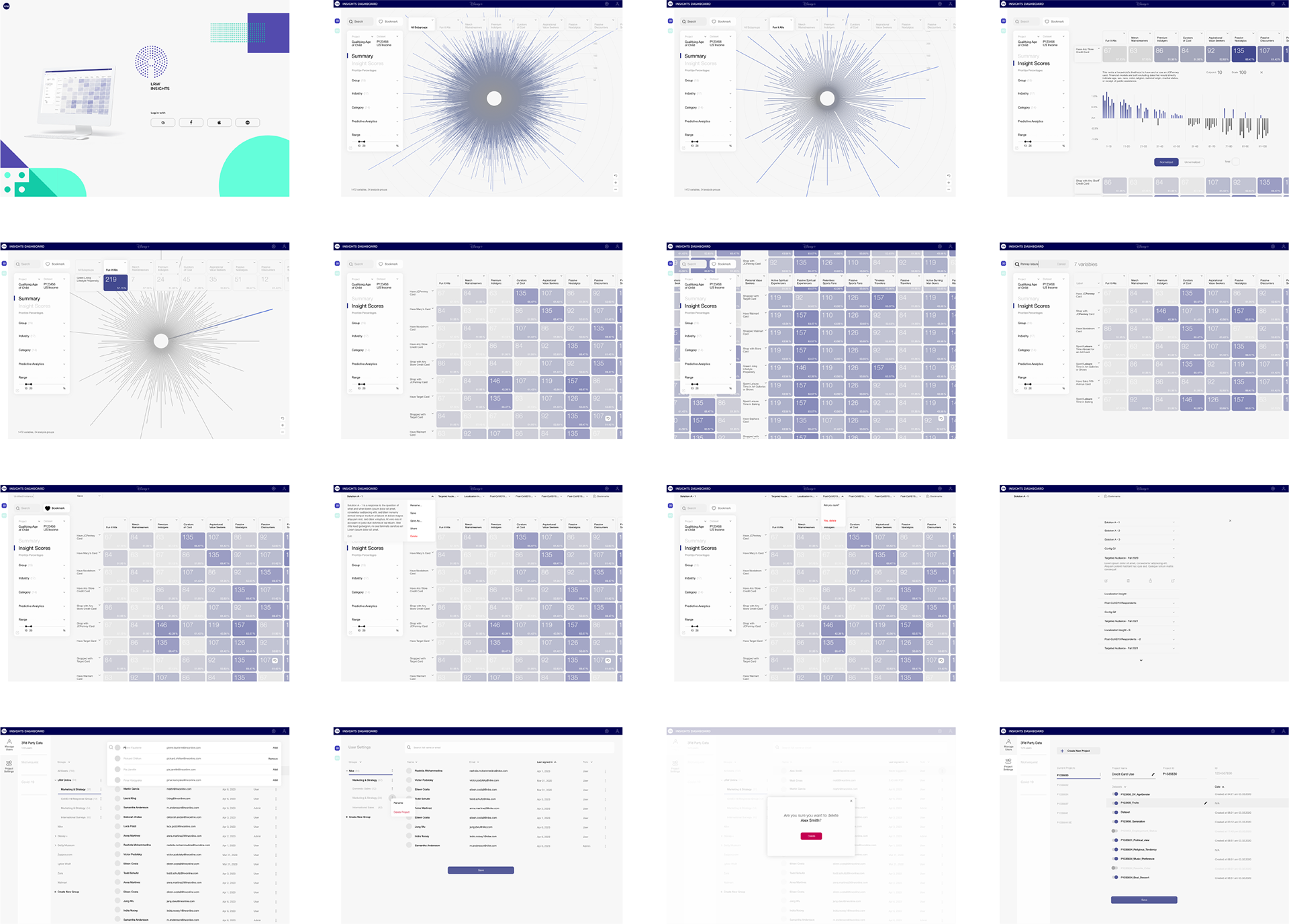
Complete experience:
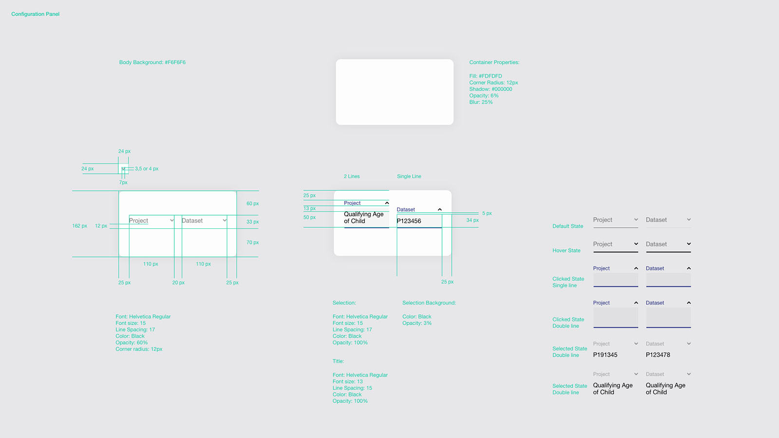
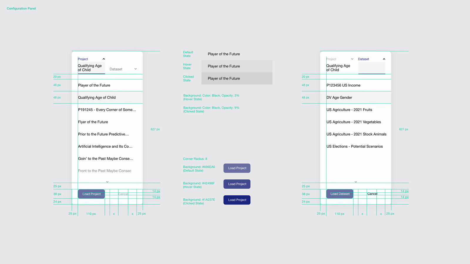
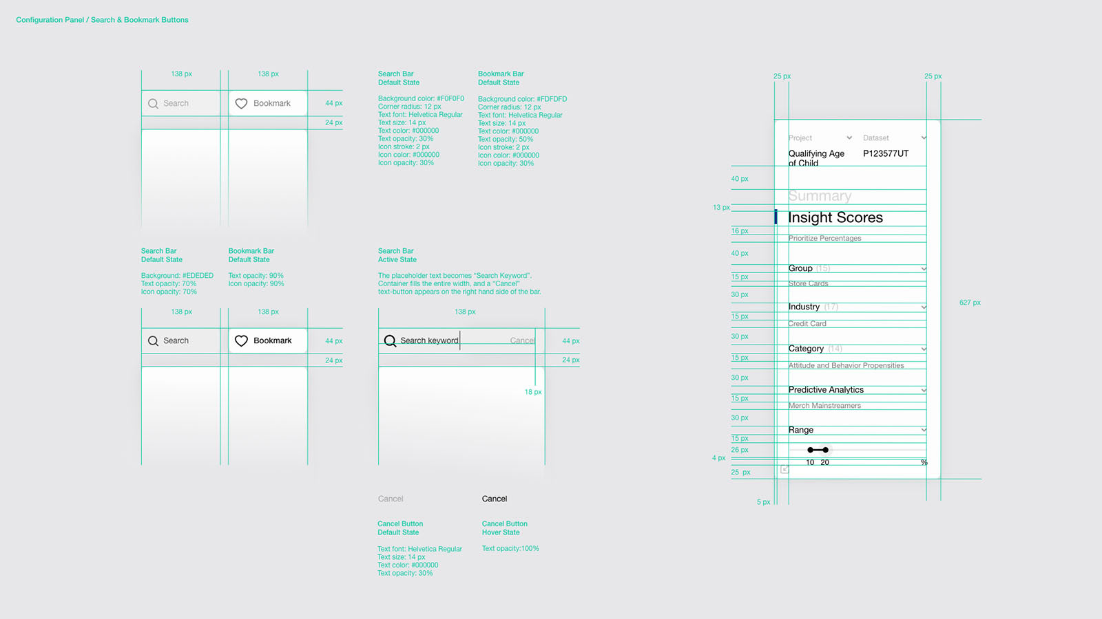
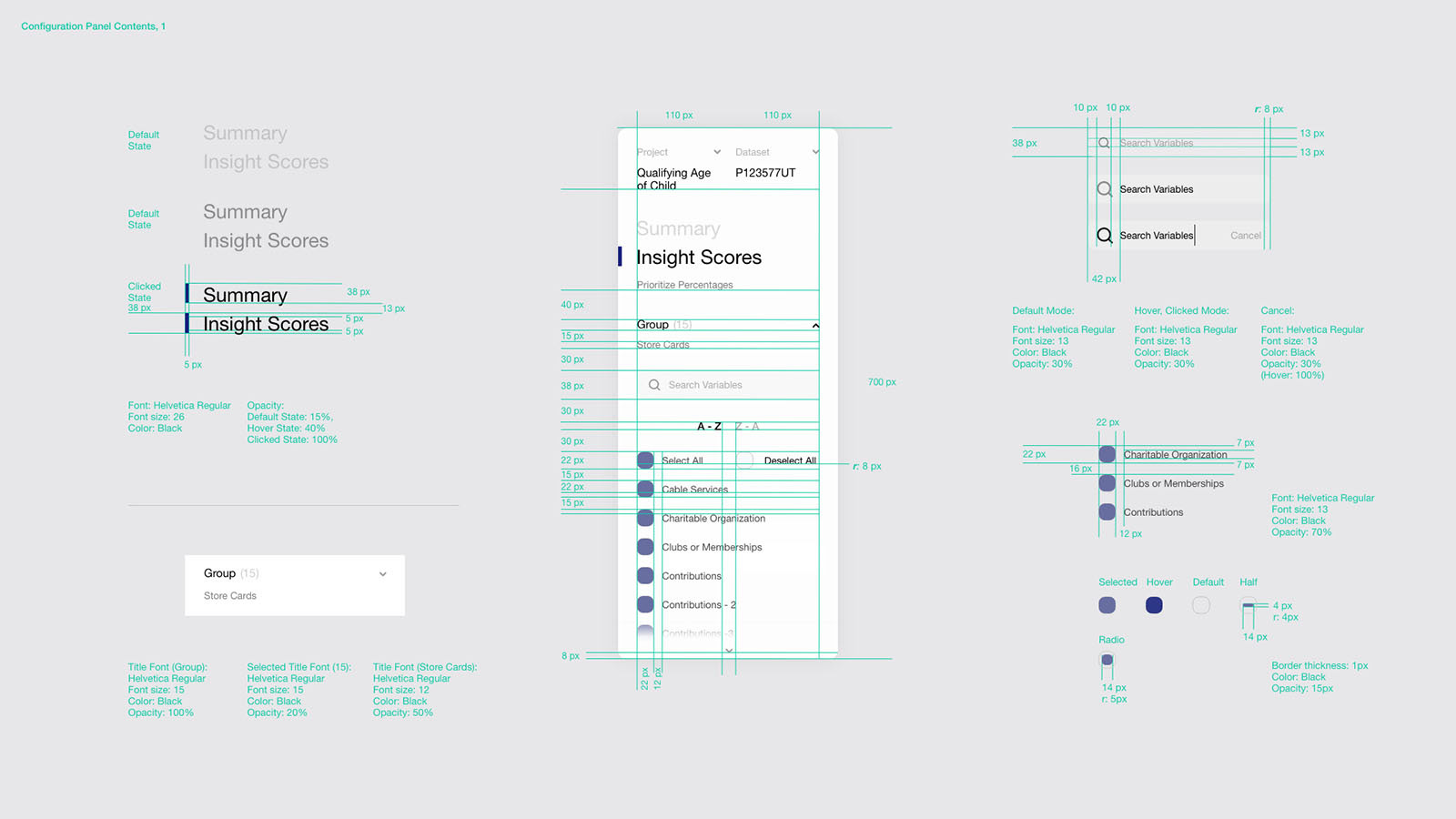
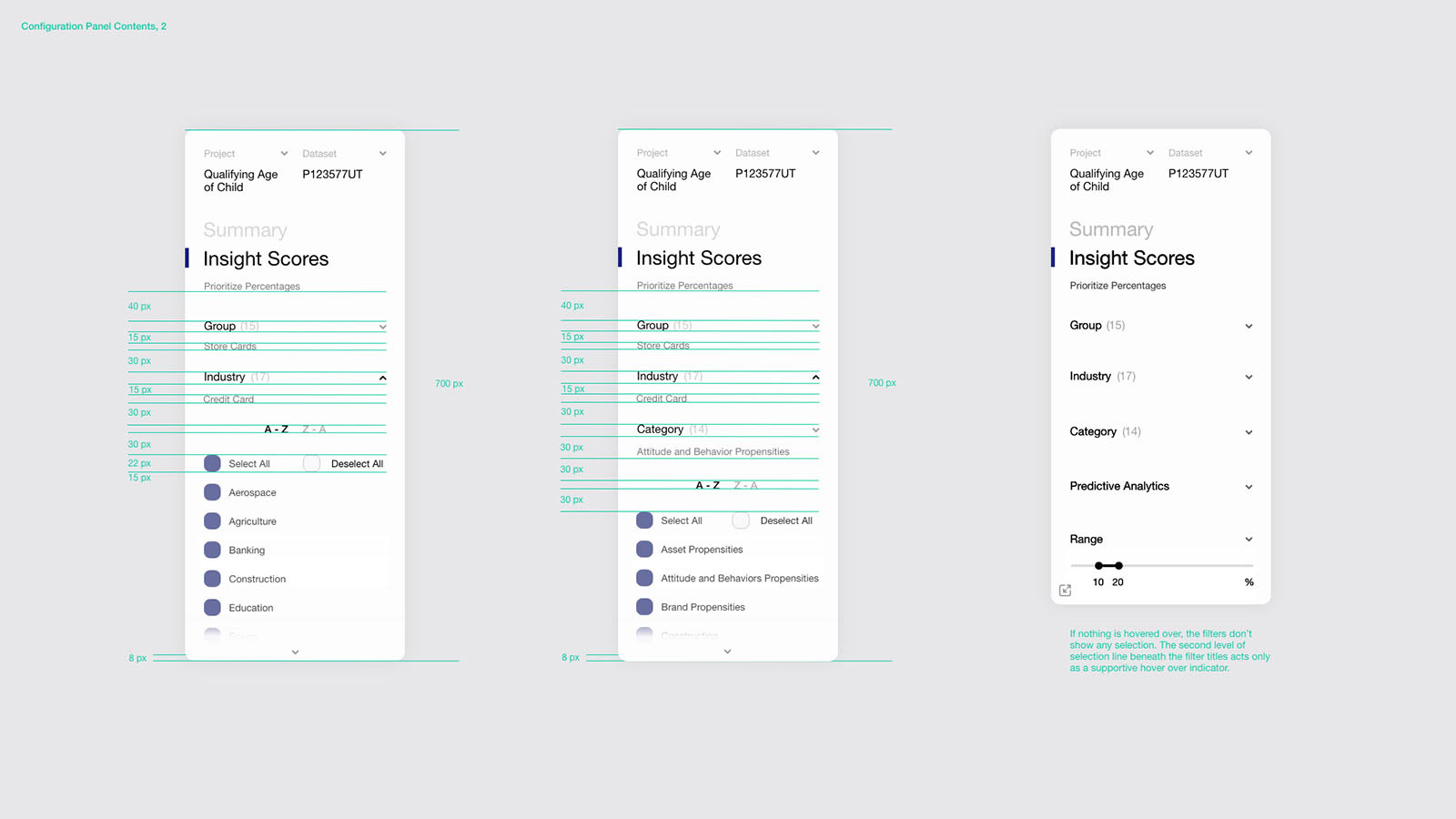
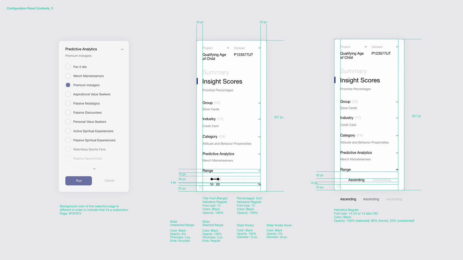
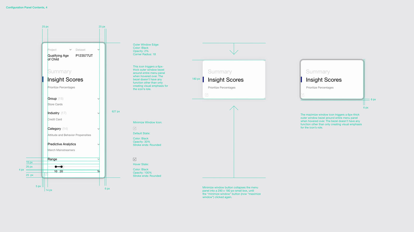
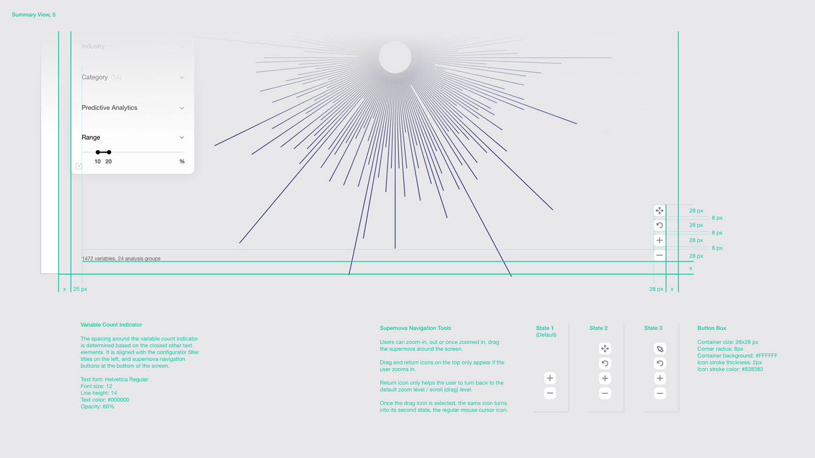
The main configuration panel assists the user in importing, customizing, and interpreting any survey data, dynamically floating over the screen as the most prominent element of the interface
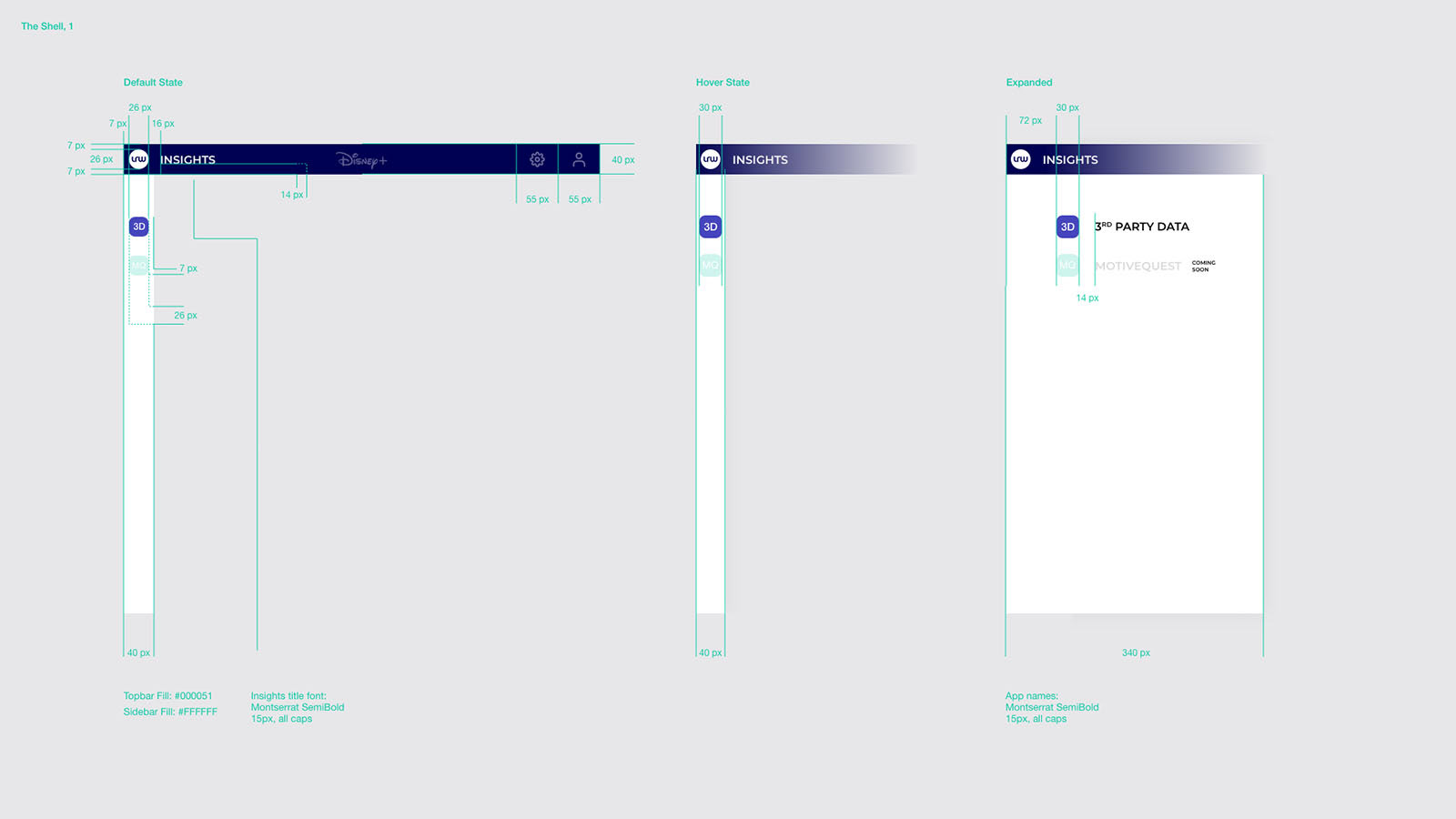
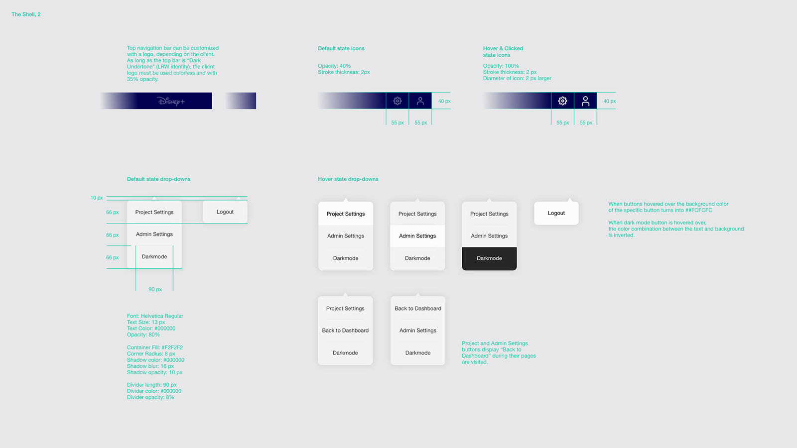
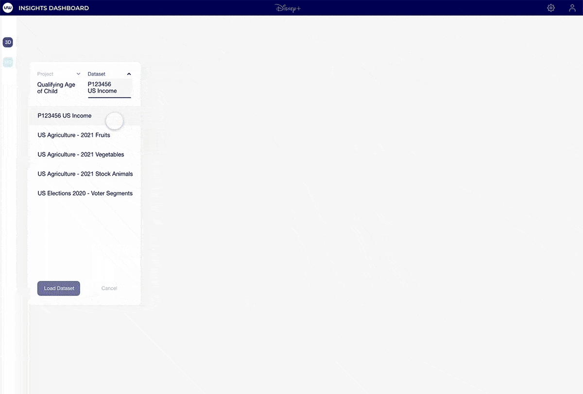
Landing page and overall "shell" which comprised of an app panel on the left, and a top nav bar, accommodating the user & admin settings
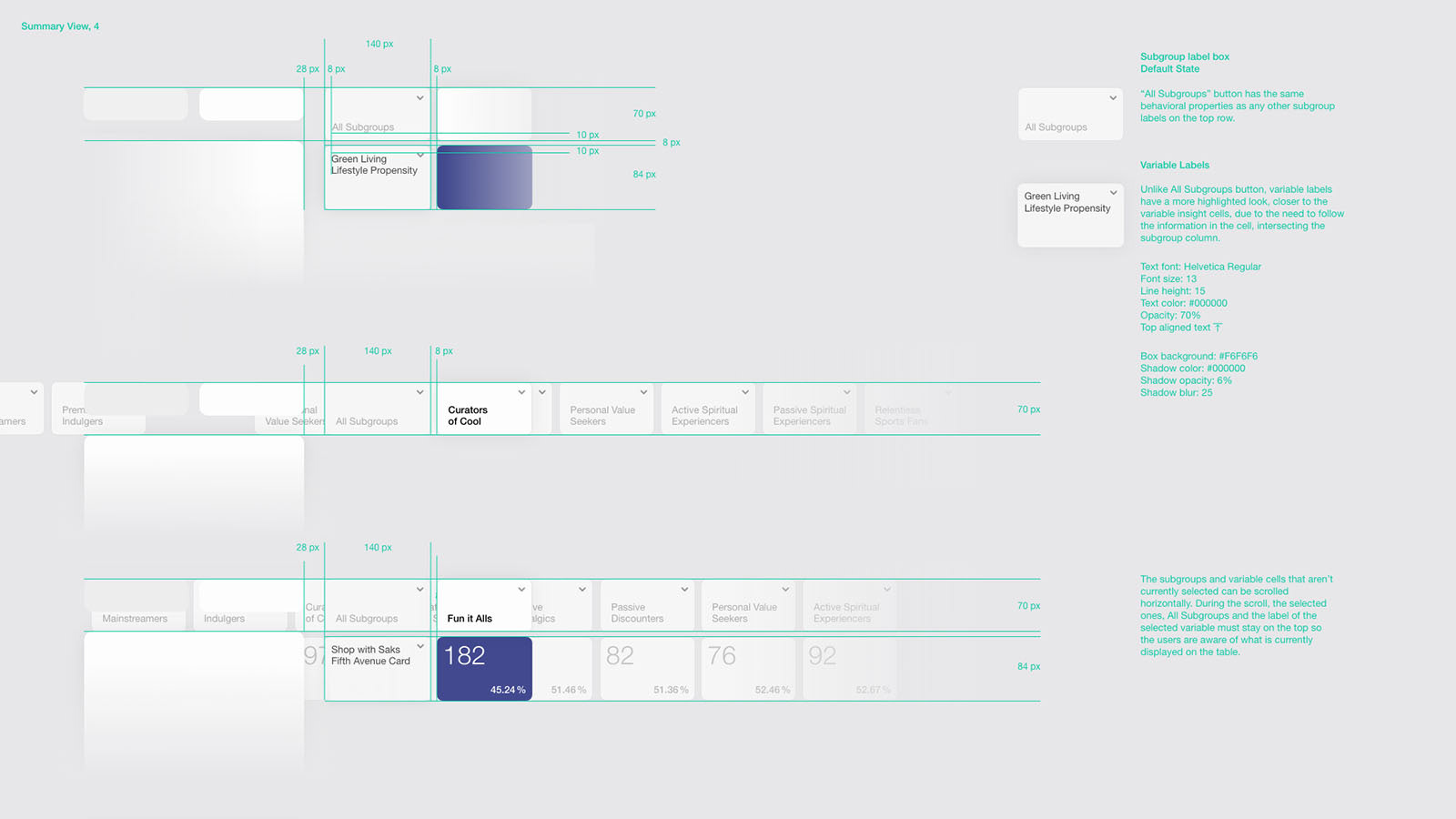
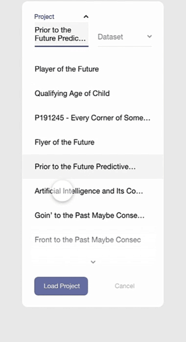
Upon logging in, users are prompted to choose a pre-produced research project and a dataset and start interacting with data output through subgroups (research segments)
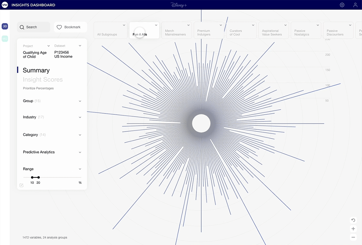
Once a subgroup is selected from the top row, the dataset is narrowed down to one column of output that has all of the survey variables, allowing users to see the differences between insight scores.
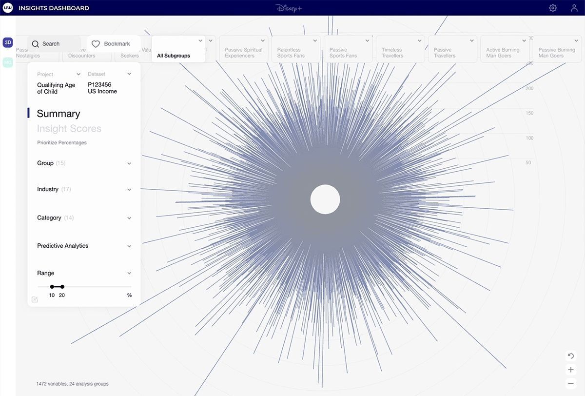
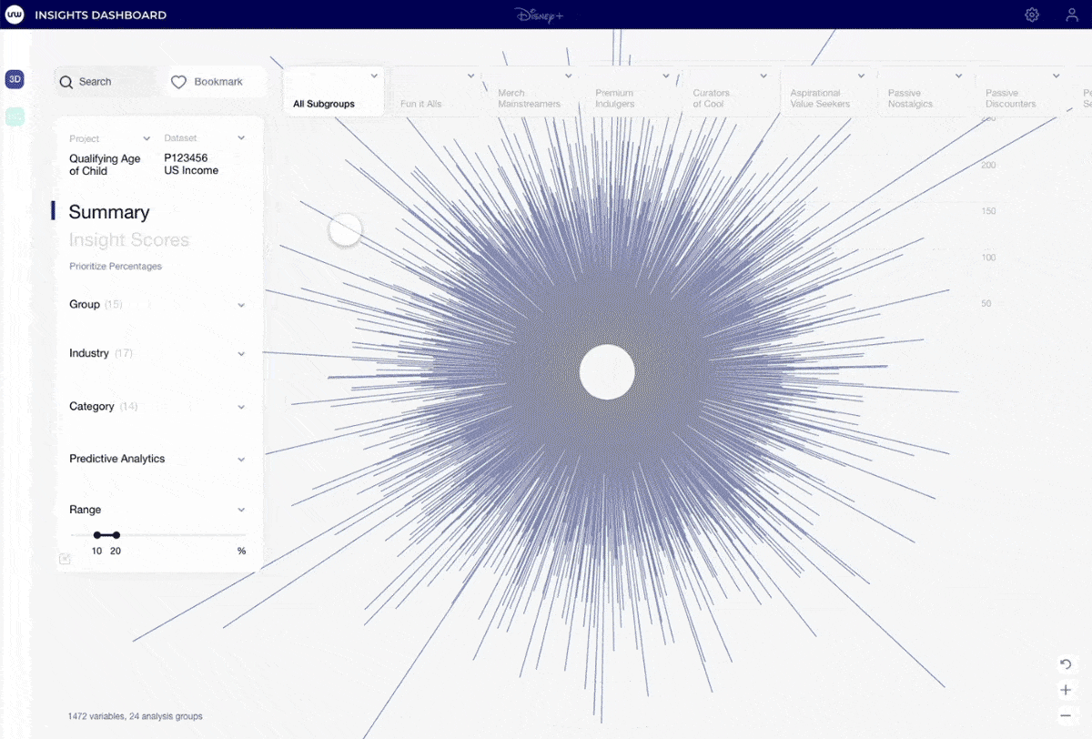
Users interact with variables and subgroups. Selecting a subgroup reshapes the graph, representing cross-correlated data. Selecting variable locks the correlation so the user can start configuring the data output
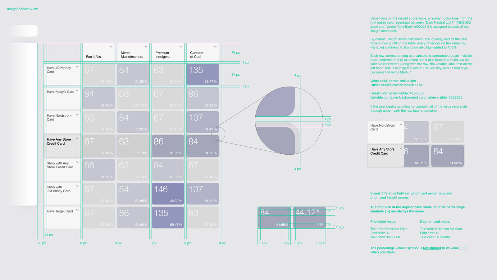
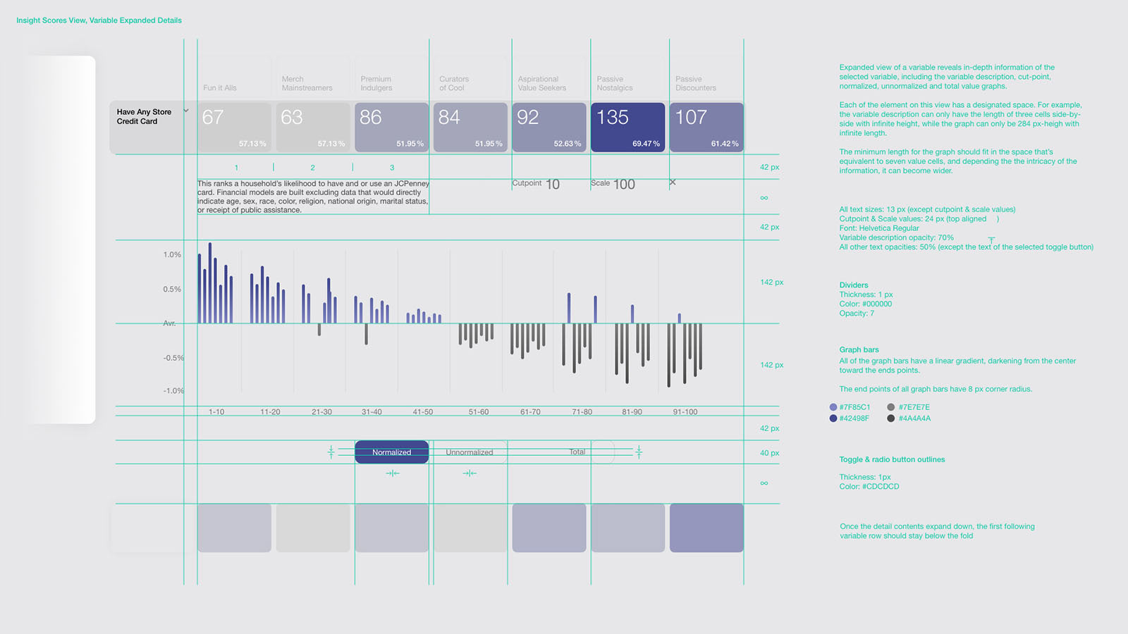
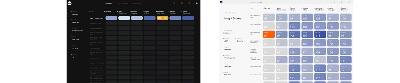
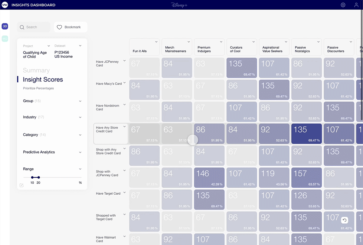
Once a variable is selected, users can switch the interface into a more in-depth view that displays the entire set of variables in a table view. This view is helpful because the output can prorate thousands of variables and dozens of subgroups
Once a specific variable is selected (a single spike in the Summary view), users can see normalized or unnormalized versions of its subgroup scores
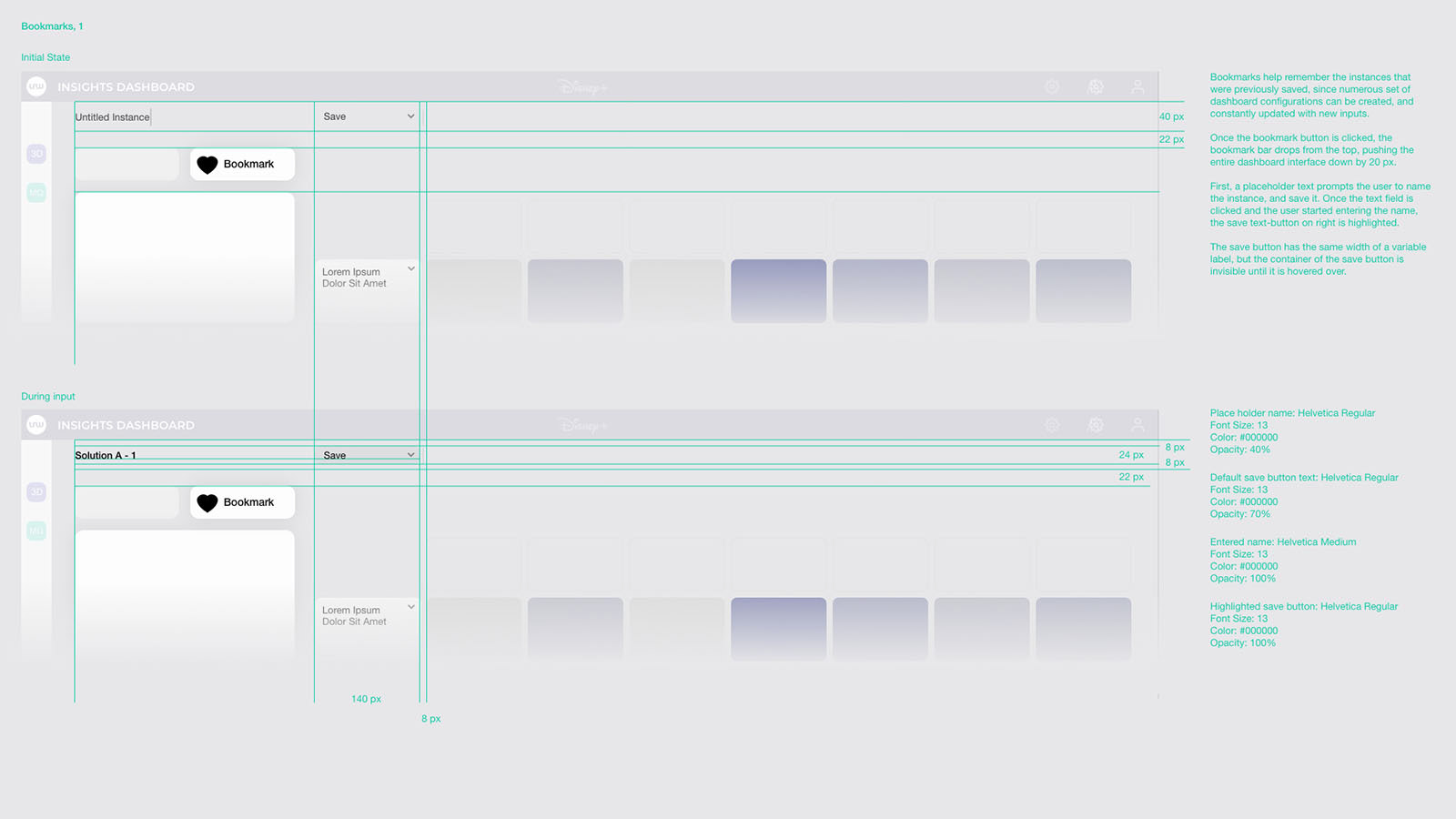
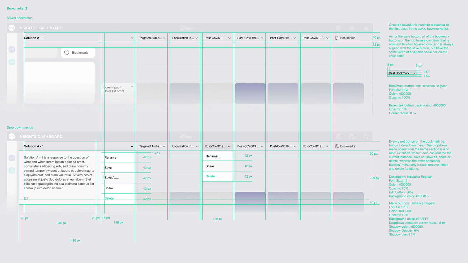
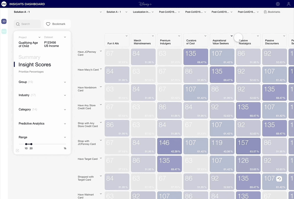
Users can save the dataset configuration as a bookmark to revisit, reorganize or share with others.
Each client that has access to the system assigns admins and a super admin with a role that manages provided datasets and user privileges.
Along with the design files, I delivered a reference book to help our dev team for the remaining 3 weeks: